

Trying to figure out how to increase your SaaS revenue with UX?
Well, you’ve just found the right place.
Smart SaaS user experience design can boost conversion rates by up to 200%, directly driving revenue growth.
In this guide, you’ll learn how small UX improvements can create big business results. We’ll cover what UX really means for SaaS, why it impacts revenue more than most founders realize, and how you can start improving conversion, retention, and expansion today.
Overview: What is UX for SaaS?
In its simplest form, SaaS user experience is how your product helps users solve their problems as quickly, clearly, and smoothly as possible. It’s not just about making screens look nice. It’s about how easy it is for people to get value from your software.
UX covers the full experience users have with your product and brand. It shows up on your website, in sign-up flows, during onboarding, inside dashboards, across daily workflows, and even in how upgrades or referrals are framed.
In short, almost anywhere someone interacts with your SaaS, UX plays a role. Without good UX, people struggle to see your product’s value or stop using it altogether.
At first, UX can seem like a small part of product design. But the deeper you look, the more you see how far it reaches across your business. Once you understand UX in SaaS, you start to see how many touchpoints it actually shapes.
UX isn’t about arranging pretty buttons or adding smooth animations. It goes far beyond aesthetics. It’s part clarity, part psychology. For SaaS businesses, UX is a key driver of adoption, retention, and growth. It’s how workflows improve, users succeed, and revenue compounds.
As you’ll see as we go on, great UX comes from methods that have been tested, refined, and proven over time. And like any other business skill, effective UX is something you and your team can learn too.
Who Can Benefit from UX in SaaS?
You don’t need to be a designer for UX to make an impact. What matters is that you have a product people use, or at least a base of users or customers you’re starting to grow.
Most companies see the biggest gains from UX once they have a steady flow of visitors, signups, or revenue. But you don’t have to wait until then to start improving it.
SaaS user experience is about traction. If you’ve been focused mainly on getting new signups, it’s time to rethink how growth actually compounds. Classic marketing advice says to “get more leads,” but few talk about what happens after the signup. Real SaaS growth comes from refining what’s already working, making every interaction smoother, faster, and clearer.
Chasing more traffic alone won’t get you far. What happens inside your product or on your site matters just as much. The real advantage comes when you start observing and simplifying every step, cutting friction until the path to value feels effortless. Because better UX doesn’t just improve experience; it multiplies revenue.
Think about how many SaaS sites make you click through three different buttons before you even see what the product does. That kind of friction kills momentum. And in SaaS, momentum is growth.
Still, not all SaaS growth works the same way. The role UX plays depends on your model. In product-led growth, great UX turns trials into active, retained users. In sales-led growth, it smooths out demos, builds trust, and helps close deals faster.
Even if your business is fully product-led, the same principles apply. Clarity, flow, and reducing friction are what make users stay, convert, and expand.
That’s where we can break it down into the three areas with the biggest impact.
3 Key Areas Where SaaS User Experience Impacts Revenue
To understand how SaaS user experience drives revenue growth in SaaS, it helps to look at where it makes the biggest difference. Here are three key areas where UX directly impacts business results.
Website Conversion
A website conversion starts the moment someone visits your site. In SaaS, this is when potential customers decide whether your product can solve their problem and whether it’s worth taking the next step.
Conversions depend on how clearly your product’s value is communicated — from the words on the page to the visuals that show what it does. When your website offers one clear path forward, visitors know exactly how to start a trial or book a demo, without confusion or unnecessary choices getting in the way.
According to common benchmarks, focusing on one primary call-to-action such as “Start Free Trial” or “Book Demo” can immediately lift SaaS conversion rates, while too many options slow people down.
Dropbox’s 2024 homepage update shows this in action. A simpler layout, focused message, and strong visuals led to over 230,000 more sign-ups per year and a measurable increase in subscription revenue.
Product Onboarding
Product onboarding is where new users decide if your software is worth their time. It’s the stage that determines whether they’ll become active customers or drop off.
Guiding users well through this stage helps them see value fast, which directly impacts activation and revenue. When the first screens feel confusing or empty, many users leave before they understand what your product can do for them.
If you want more people to activate, onboarding should feel simple, helpful, and clear.
A good example is Voxox, which made its onboarding short, focused, and centered on one feature at a time. Each step showed the benefit, pointed to the next action, and helped users see value right away. This simple change led to more activations and less churn — proving that strong onboarding is not just good UX, but good business.
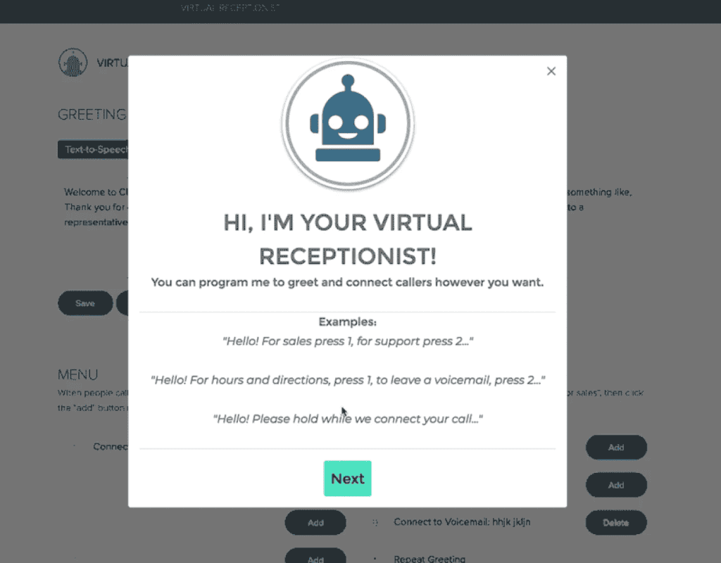
The result of strong onboarding is higher activation, better retention, and more paid users.
User Retention
Users stay with a product only if it the SaaS user experience feels modern, simple, and enjoyable to use. Just like first impressions during onboarding, the everyday experience decides whether they will keep coming back over time.
It’s hard to keep people engaged when the product feels dated or clumsy to move around. As mentioned earlier, confusing steps or clunky flows quickly push users toward competitors that feel smoother and faster.
Some products manage to hold users for years because their core workflows are seamless and intuitive, but retention is never automatic. It takes real effort to refine the most-used parts of the product and make navigation clear and predictable.
Supacart, an eCommerce platform, once lost 8.2% of users each month due to confusing navigation, complex steps, and weak mobile design. After simplifying flows, improving error messages, and fixing mobile usability issues, churn dropped to 2.2% within three months. The sharp decline meant major revenue savings, showing how a smoother experience directly boosts retention and spending.
The long-term upside of retention is far greater than short-term wins from signups. Only the ongoing experience determines how long a user stays. When the product continues to feel valuable and effortless to use, users not only stay longer but also upgrade and recommend it for years.
Top SaaS User Experience Practices Every Founder Should Master
You don’t need to apply all these practices at once. But as your SaaS grows and you focus more on improving the user experience, you’ll notice these same principles showing up again and again.
1. Keep Calls-to-Action Clear and Simple
It doesn’t matter how polished your homepage or pricing page looks. If visitors are split between starting a free trial or booking a demo, they’ll hesitate, and many will leave before trying your product.
For example, on FreshBooks’ homepage, the hero section shows both “Buy Now & Save” and “Try It Free.” This creates two competing actions instead of one clear path.
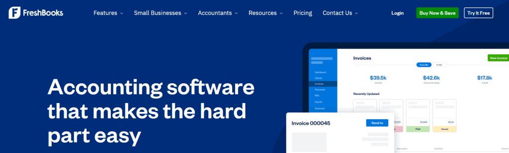
Great SaaS founders know how to narrow the focus to a single call-to-action that fits their growth model, and they keep that focus consistent from the first click to the moment users start engaging with the product.
2. Make Onboarding Feel Like a 5-Star Experience
Founders want new users to see value fast. And in SaaS, that first impression often comes down to how smooth your onboarding feels. A strong onboarding experience helps users get quick wins so they feel confident, cared for, and ready to keep using the product.
That moment starts with the first journey a user takes. The onboarding flow is the exact path you want every new user to follow, whether that means setting up an account, finishing an integration, completing a key task, or something else.
A clear, welcoming onboarding flow isn’t just good UX. It’s a business growth tool that directly drives activation, conversion, and long-term retention.
Let’s take a real-life example.
Have you ever signed up for a tool and been dropped into an empty dashboard with no direction? Now imagine the opposite: a guided path that shows sample data, explains the next step, and reminds you why you signed up in the first place. That’s what a 5-star onboarding experience feels like.
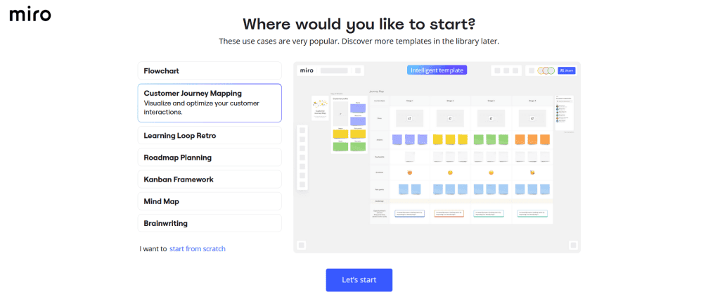
One simple way to deliver that experience is through greeting modals. A greeting modal is a welcome screen that appears the moment a new user enters your product. It sets the tone, points to the most useful features, and gives people a clear first step so they know exactly where to go. Miro, for example, uses one to guide new users right from the start.
3. Turn Empty States into Engaging First Steps
Empty dashboards are not harmless. SaaS users sign up for trials, log into products, open apps, and explore new tools every day. These users are often your best potential customers because they’re curious and motivated to see if your product can solve their problem.
But when they land on a blank dashboard, most won’t explore further. SaaS users want to see value, not emptiness. If they open your product and find nothing to guide them, they leave. They churn. And this becomes one of the biggest missed opportunities in SaaS.
That’s why your empty states should be designed with purpose, not decoration. Instead of showing a dead screen, fill it with demo data or starter templates that are easy to follow. This gives users a clear next step and helps them experience value right away.
Fact: when dashboards include sample data, templates, or a simple first action, users engage faster and are far more likely to stick with the product.
4. How to Frame the End Result to Push Through Setup Friction
Users are impatient. When a new customer signs up for your SaaS product, they don’t want to focus on the technical steps. They want to see the business result they came for. It’s like putting together furniture — if you can’t picture the finished piece, the screws and tools start to feel pointless.
One of the biggest lessons in building SaaS products is learning to keep the promised outcome front and center.
Too many products leave users staring at setup instructions instead of connecting those steps back to the payoff.
Think about how different two onboarding messages could feel.
The first one might read: “Step 1: Connect your data source.”
At first glance, it doesn’t sound wrong. In fact, it feels very normal. That’s what you’d expect during setup.
But another message could read: “Step 1: Connect your data source so you can start seeing more leads.”
The user doesn’t care about the step itself. They care that it leads to the result they signed up for. The second version pushes more users through setup simply because it keeps the result at the center of the action.
When designing your SaaS onboarding, always put the end result first. Frame each step around the promised win and show a clear path forward..
5. Know the Difference Between Technical Metrics and User Value
Part of putting your customers first is making your product feel simple and clear.
As a SaaS founder, one of the first things to learn is how to separate technical metrics from user value. You need to understand both so you can measure performance internally while showing customers how your product actually makes their work easier or their results better.
Technical metrics describe how your system measures cost or usage. The backend stuff. When a SaaS app says pricing is based on API calls or server time, it’s referring to a metric. That makes sense to engineers but not to most customers.
User value, on the other hand, describes the real outcomes your product creates for the customer. If your metric is that you pay per API call, the value might be that customers can schedule more meetings, store more projects, or generate more revenue.
Technical metrics explain how the system works. User value explains what the customer gains. Translating metrics into outcomes is how you make your product’s impact clear and help customers connect your pricing to the results they get.
Nine times out of ten, people don’t keep using a product because of metrics. They stay for the value.
How to Improve SaaS User Experience in 5 Practical Phases
You don’t have to apply all these practices at once. But as you grow your SaaS and start improving the user experience, you’ll notice these same practices coming up again and again.
Phase 1: Learn Who Your Users Are and What They Really Want
Cue the montage: scrolling through trial sign-ups, mapping onboarding steps, replaying sessions, sticky notes filling a product board…
You don’t need a PhD in user research to improve SaaS UX. But it helps to show your team or investors that you’ve uncovered what your ideal customers are trying to achieve — and that you’ve mapped the exact results they expect from your product.
When it comes to learning, there are plenty of places to start. You can talk with trial users, send surveys to paying customers, review churn reasons in your CRM, or watch how people click through your onboarding flow. There are analytics tools that range from free dashboards to advanced tracking platforms. You can also study competitor reviews, listen to sales calls, or shadow customer support as they handle recurring issues.
In most cases, your understanding of the user will come from a mix of these inputs. The goal is to connect the dots between what users say they want and what they actually do inside your product.
For example, a SaaS team might combine interviews that reveal the outcomes users signed up for, heatmaps that show where they slow down, churn notes that explain why they leave, and support tickets that highlight repeat problems. Together, these insights form a clear picture of what users want, and how the product can guide them there.
Phase 2: Map Out the First Wins
You didn’t stay motivated in a new app by waiting months to see results. You stayed because you saw a quick win that proved the product was worth your time.
While it’s important to understand the bigger goals your customers have, at some point you need to guide them through a simple flow that shows your software can actually deliver on its promise.
Imagine your SaaS promises more leads, more sales, or more time saved. If the user doesn’t see any of that in their first session, most will leave. But if you direct them to one easy action that shows real value within minutes, they’ll stay longer, explore further, and start building trust in your product.
You don’t need to deliver the full business outcome upfront. The deeper results might take weeks of consistent use. But no matter how powerful your software is, nothing builds confidence like giving users one early success that confirms they made the right choice.
Here are a few ways to map first wins in SaaS:
- Highlight one core feature that shows value on first login
- Use demo data or templates so dashboards look meaningful right away
- Guide users to the action most directly tied to their promised outcome first
Phase 3: Design Specific Paths for Buyers, Users, and Developers
Once you’ve shown the first wins and built momentum, it’s time to shape experiences that match the different roles interacting with your product.
Start with your buyers. Guide them through a journey that builds trust in your product’s value by showing clear proof, removing doubts, and helping them feel confident to commit.
Next, focus on your end users. They need fast activation. Take them straight into a workflow that shows how your product makes their daily work easier and more effective.
Finally, support your developers. Give them a focused technical onboarding experience with clear docs, APIs, and tools ready to go so they can integrate and test without friction.
Phase 4: Build Retention Around Everyday Workflows
Most successful SaaS products have one thing in common: their SaaS user experience makes daily workflows so smooth that users don’t even think about leaving.
Once your SaaS has convinced people to join, the next goal is to keep them engaged inside the product. The best way to do that is by improving the experience of the actions they perform most often.
This means shaping the product around their core use cases and removing friction from repeated steps. When everyday tasks feel effortless, users naturally stay because the product fits seamlessly into their routine.
You can also strengthen retention through navigation and dashboards. Here, it’s not just about smoother tasks but about showing value in a way users can feel every day. By arranging features in order of importance and surfacing key data on dashboards, you make your SaaS the default tool they rely on and keep coming back to.
Phase 5: Use Contextual UX to Drive Expansion at the Right Time
No matter the SaaS, the key to driving expansion revenue is showing upgrade prompts only when users are getting the most value from your product.
That’s right, we’re circling back to the core of great SaaS growth. Timing is everything. Use contextual UX to surface upgrades at the exact moment users are ready for more.
Have Fun Growing with Smarter UX
As you keep improving the way people experience your SaaS, come back to these ideas whenever you need a quick reminder of what drives growth.
SaaS UX is fun, creative, and, most importantly, a powerful lever for lasting growth. If you’re building a business that blends great design with smart strategy, focusing on UX is one of the best moves you can make.
Why Clio Websites
A better user experience doesn’t matter if your site or product is hard to use.
At Clio, we work with SaaS founders to turn confusing flows and outdated pages into clear, fast SaaS design that helps people sign up, stick around, and upgrade.
We’ve helped hundreds of SaaS companies improve the way users move through their site and product, not just the way it looks.
Contact us today, if you want a website and UX that feel effortless for your customers (and actually drives growth).